CONCEPTS AND DEFINITIONS 4
The Eight Principles: ISO 9000's

These eight principles represent the total quality philosophy to which the organization must adhere in order to develop the cultural environment necessary for an effective, conforming QMS.
Pareto Charts
|
Pareto charts are useful for separating the important from the trivial. They are named after Italian economist and sociologist Vilfredo Pareto, who developed the theory that a majority of problems are caused by a minority of causes. Pareto charts are important because they can help an organization decide where to focus limited resources. On a Pareto chart, data are arrayed along an x-axis and a y-axis |

|
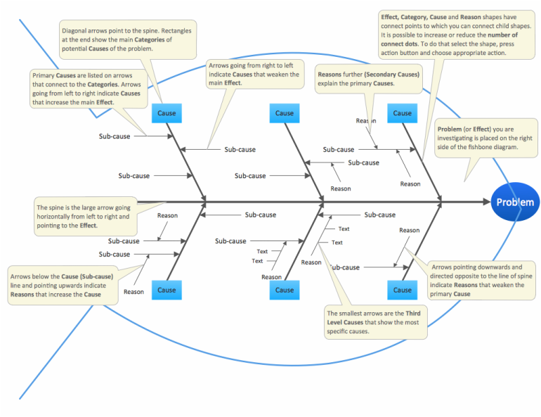
Fishbone Diagrams
|
This is a cause-and-effect diagram usually used by teams to identify and isolate causes of a problem. The technique was developed by Dr. Ishikawa and for this reason it is also called the Ishikawa diagram. This quality tool unlike the others is not based on statistics and provides means of visualizing how the various factors associated with a process affect the process's output. It serves as an excellent reminder that the items noted on it are the things the company needs to pay attention to if the process is to continually improve. |
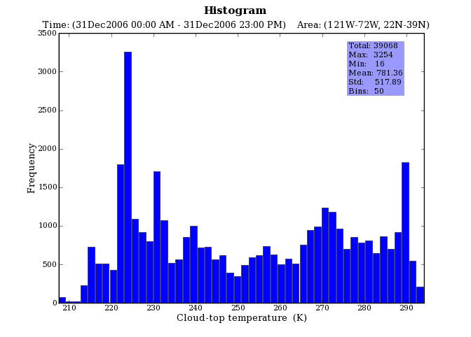
Histograms
|
This quality tool is used to chart frequency of occurrence. How often does something happen? Any discussion of histogram must begin with an understanding of the two kinds of data commonly associated with processes: attributes and variables data. An attribute is something that the output product of the process either has or does not have. Variable data is something that results from measurement. In conclusion a histogram is a measurement scale across one axis and a frequency of like measurements on the other. |
|
Control Charts for Variables

|
Control Charts are the appropriate tool to monitor processes. It is a much more sophisticated outgrowth of the run charts. In a control chart, data are plotted over time, just as with a run chart; the difference is that the data stay between the upper control limit (UCL) and the lower control limit (LCL) while varying about the centerline or average only so long as the variation is the result of common causes. Whenever a special cause (non-statiscal cause) impacts the process, the following can happen: Either a plot point will penetrate the UCL and LCL, or there will be a run of several points in a row above or below the average line. The properly used control chart will immediately alert the operator to any change in the process. The appropriate response to that alert is to stop the process at once, preventing the production of defective product. Only after the special cause of the problem has been identified and corrected should the process be restarted.
|
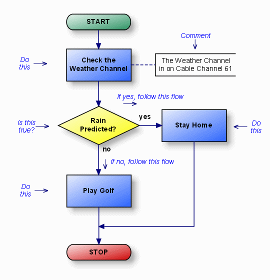
Flowchart
|
It is a graphic representation of a process. A necessary step of improving a process is to flowchart it. Particularly, in a total quality setting, it is used for charting the inputs, steps, functions, ans outflows of a process to understand more fully how the function works and who or what has input into and influence on the process, its inputs and outputs, and even its timing.
Ex: The graph on the left shows the path/process of an event and how it will run depending on certain conditions: The graph shows the process of watching the Weather channel and the decisions on whether to stay home or play golf as a function of the prediction of rain. |
FMEA: Failure Mode and Effects Analysis
This is an analysis that tries to identify all the possible types (modes) of failures that could happen to a product or a process before they happen. The procedure is to first identify all possible "failure modes," then implement effect analysis and study the potential consequences of those failures. The consequences of such failures are ranked by:
- Seriousness/Criticality to the customer
- Probability of the fault's occurrence
- Probability of the fault's detection by the systems responsible for defect prevention or detection.
